print maxxing thanksgiving table ideas
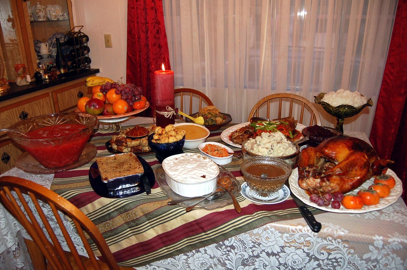
Thanksgiving tables have spent years playing it safe: a neutral runner, a few pumpkins, done. But print maxxing throws that rulebook out the window. Borrowed from maximalist interiors, print maxxing is all about layering bold, joyful patterns — florals on stripes, gingham beside toile, polka dots dancing next to plaid — until the table feels abundant, personal, and unapologetically festive. And honestly, no holiday suits the look better than Thanksgiving, a celebration built on abundance itself. A print-maxxed table looks generous before a single dish arrives. It photographs beautifully, sparks conversation, and lets you use the linens and dishes you already love instead of buying a matching set. The trick is not restraint but rhythm: mixing scales, repeating a color thread, and grounding the chaos with solids. This guide walks you through twenty ideas for building a Thanksgiving table that is maximalist in the best way — layered, warm, and full of personality.

1. What Is Print Maxxing (and Why It Belongs at Thanksgiving)
Print maxxing is the design world’s permission slip to stop matching and start layering. Where minimalism whispers, print maxxing sings: it stacks patterns of different scales, eras, and moods on a single surface and trusts a shared color story to hold them together. Think of a grandmother’s floral tablecloth under modern striped napkins, with gingham placemats and a polka-dot runner thrown in for good measure. At Thanksgiving, this philosophy feels tailor-made. The holiday is literally about plenty — a table groaning with dishes, generations crowded elbow to elbow — so a table that looks abundant before the food arrives sets exactly the right tone. Print maxxing also solves a real hosting problem: you don’t need a perfectly matched set of anything. That chipped floral plate collection, the striped napkins from last year, the plaid runner you impulse-bought — they all belong. The style celebrates the collected-over-time look that makes a home feel loved rather than staged.

2. Start With a Statement Tablecloth
Every print-maxxed table needs an anchor, and the tablecloth is the biggest canvas you’ve got. Choose something with presence: a large-scale floral, a bold botanical, a vintage-inspired toile, or even a dramatic fruit print. This base layer sets the color story everything else will riff on, so pick the cloth first and build outward. Don’t shy away from color — deep berry florals, golden marigold prints, or rich green botanicals all feel seasonally right for late November. If your table is beautiful wood and you’d rather show it off, a statement cloth isn’t mandatory, but for true print maxxing it does heavy lifting by establishing pattern number one. Thrift stores are goldmines for patterned tablecloths with the slightly faded, storied quality that makes maximalism feel authentic rather than purchased all at once. Wash and press it the day before so the foundation looks intentional from the start.

3. Layer a Second Print With Your Runner
Once the tablecloth is down, the runner is your first deliberate clash — and that’s the point. A runner in a contrasting pattern running down the center creates a visual runway for your centerpiece and instantly doubles the pattern count. The classic move is pairing a floral cloth with a striped runner, or a solid-ish botanical with a gingham check. Keep the runner’s scale different from the cloth’s: small check over large floral, or wide stripe over ditsy print. This contrast in scale is what keeps two patterns from fighting. Let the runner hang over the table ends for a relaxed, generous feel, or tuck the ends under for a tidier look — both work in a maximalist setting. If you own two runners you love, layer them slightly offset for even more depth. The center of the table can handle the most pattern density since dishes and the centerpiece will partially cover it anyway.

4. Mix Patterns, Not Clashes: The Scale Rule
The difference between glorious print maxxing and visual chaos comes down to one principle: vary the scale of your patterns. Pair a large-scale floral with a medium stripe and a small polka dot, and the eye reads it as curated. Put three large-scale prints together and they compete for attention. Before you commit, lay everything on the table and squint — literally. If one pattern dominates and the others support it, you’ve got the hierarchy right. A useful formula is one hero print (the tablecloth or chargers), two supporting prints (runner, napkins), and one or two tiny accents (place cards, napkin rings). Repeating at least one color across all the prints is the glue: pull the rust from the tablecloth into the napkins, the cream from the runner into the plates. When the colors converse, the patterns can be as different as they like and the table still feels pulled together.
5. Printed Napkins That Steal the Show
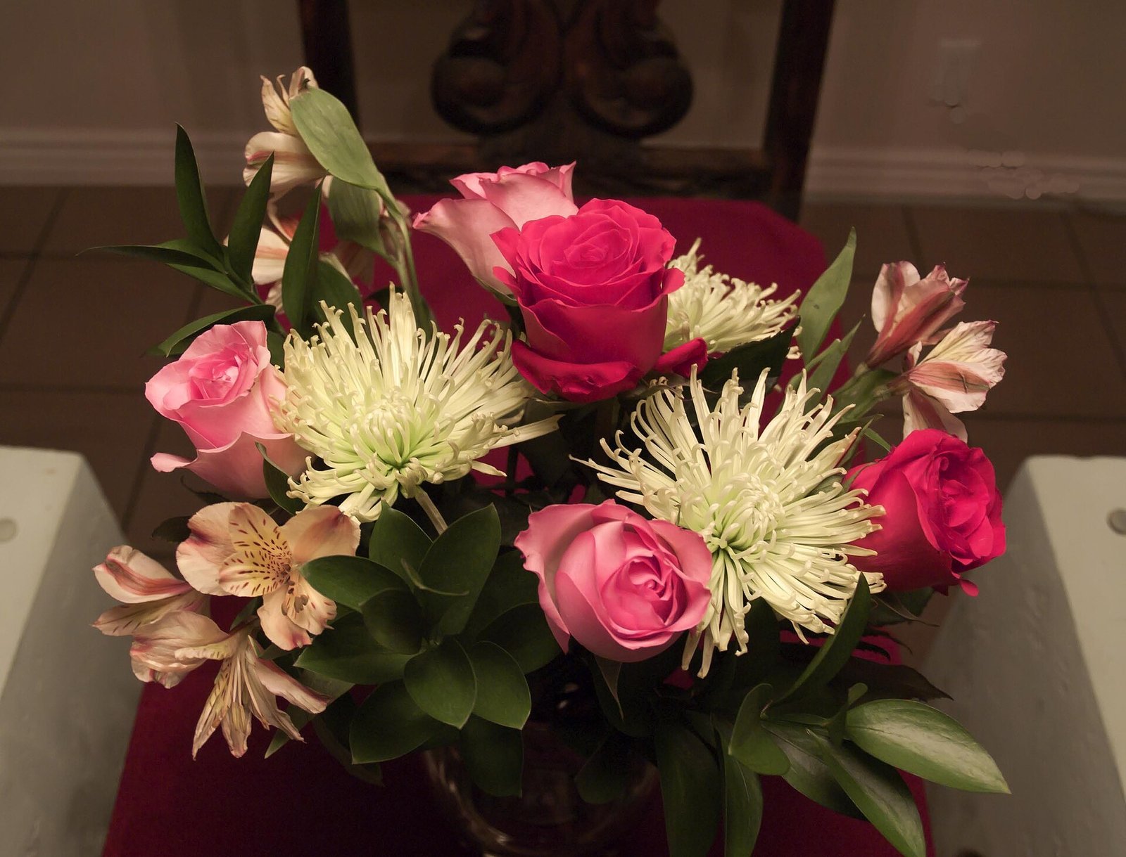
Napkins are the unsung heroes of a print-maxxed table because each guest gets a personal dose of pattern right at their place setting. This is the spot to be boldest: napkins in a print that contrasts with everything around them add energy exactly where eyes land. Try botanical-print napkins on striped placemats, or a small buffalo check against a floral cloth. Fold them simply — a rectangle fold or a loose knot — because fussy folds fight with busy prints. If you’re mixing napkin patterns (entirely allowed in print maxxing), keep them in the same color family so the place settings feel like variations on a theme rather than random. Cloth napkins are worth it here; paper napkins with prints tend to look flat and can cheapen the layered effect. Iron or steam them the morning of — crisp napkins against a busy table read as deliberate, while wrinkled ones read as accidental.

6. Floral Chargers Over Striped Linens
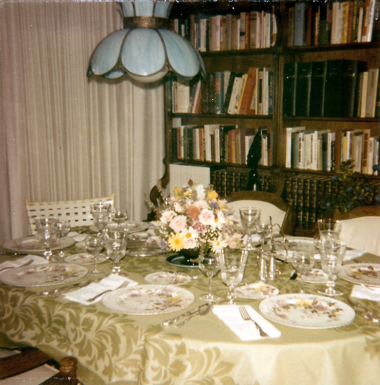
Chargers are the frame around each place setting, and a printed charger is print maxxing at its most personal. Floral chargers — whether vintage china with rose patterns or modern melamine in bold botanicals — look spectacular against striped placemats or a striped runner. The large organic shapes of florals contrast beautifully with the linear geometry of stripes; it’s one of the most reliable pattern pairings in the book. If you don’t own printed chargers, printed paper placemats cut into charger-sized rounds are a convincing stand-in for a single dinner. Thrift stores are the best source for mismatched floral plates that can double as chargers — embrace the mismatch, since identical sets are the opposite of this aesthetic. Just keep the charger prints in the same color family as your linens, and let the patterns do the talking.

7. Gingham Meets Toile: A Classic Pairing
Some pattern pairings are classics for a reason, and gingham with toile is the peanut butter and jelly of print maxxing. Toile’s scenic, storybook quality — those pastoral scenes in a single color — gets a playful jolt from gingham’s cheerful check, and both traditionally come in the same colorways, which makes coordination effortless. Try a blue-and-white toile tablecloth with red gingham napkins for a look that’s both heritage and fun, or keep it tonal with matching colors for a calmer take. This pairing works because the patterns operate at different visual volumes: toile is intricate and detailed, gingham is simple and graphic. They don’t compete; they complement. Add a third element — a striped runner or floral plates — and you’ve got a layered look that feels collected over decades even if you bought it all this month.
8. Bring in Plaid for Warmth
Nothing says Thanksgiving like plaid, and in a print-maxxed table it’s the cozy anchor that keeps bolder prints feeling seasonal rather than random. A plaid runner or plaid napkins introduce the warm, cabin-like feeling guests associate with the holiday, and plaid’s grid structure plays well with both florals and stripes. Stick to autumnal plaids — rust, mustard, forest green, deep red — rather than preppy pastels to keep the Thanksgiving mood. Plaid works especially well as the “bridge” print: if your floral tablecloth and striped napkins feel like they’re from different worlds, a plaid element containing both color families ties them together. Layer a plaid throw over a nearby chair or bench for good measure; in print maxxing, the table doesn’t end at the table edge. Just avoid pairing two different plaids — one plaid per table is plenty.

9. Polka Dots for Playful Accents
Polka dots are the confetti of the pattern world — small, joyful, and impossible to take too seriously, which makes them perfect accents in a print-maxxed Thanksgiving table. Use dots where you want a lift of playfulness: dotted napkins, a dotted ribbon tied around the flatware, or dotted place cards. Because dots are a small-scale, simple print, they layer over almost anything without adding visual weight. A large-scale dot (think oversized confetti dots on a runner) can even serve as a supporting print rather than just an accent. Metallic gold dots on cream napkins are especially lovely for Thanksgiving — festive without being Christmas-y. The rule with dots is restraint in quantity but freedom in placement: a little dot here and there keeps the table feeling joyful, while dots on every single element would tip the balance from curated to chaotic.
10. Botanical Prints on Dinnerware
Printed dinnerware is where print maxxing gets truly personal, because your plates are probably the most “you” thing on the table. Botanical-print plates — leaves, herbs, garden flowers — are ideal for Thanksgiving since they echo the harvest theme without a single turkey motif. Layer a botanical salad plate over a solid dinner plate for a collected look, or go full maximalist with patterned dinner plates too. If your everyday dishes are solid, borrow the print through salad plates, bread plates, or even printed bowls for soup. Vintage transferware in botanical patterns is affordable at thrift stores and looks stunning mixed across different patterns in the same color. Don’t worry about every guest having matching plates — in print maxxing, the variety IS the design. Just keep the scale of the plate prints smaller than your tablecloth print so the layers read clearly.

11. Printed Place Cards and Menus
Small paper goods are the jewelry of a print-maxxed table — tiny doses of pattern that make each place setting feel considered. Printed place cards in a botanical or gingham design, tented on each plate, add a layer of pattern right where guests focus. Take it further with printed menus at each setting: a small card listing the feast in a pretty patterned border doubles as a keepsake. The trick is choosing paper patterns that relate to your linens without matching them exactly — a floral card on a striped setting, or a dotted menu against a plaid napkin. Hand-lettering names on printed cards bridges the personal and the patterned beautifully. If you’re crafty, print your own on cardstock; if not, printable templates in fall patterns are widely available. These little details are what guests photograph and remember.

12. Mixing Vintage and Modern Prints
The most interesting print-maxxed tables span decades, and mixing vintage and modern prints is how you get that collected-over-time magic. A 1970s floral tablecloth beside sleek modern geometric napkins creates tension that feels curated rather than confused. The secret is the color thread: pull one or two colors that appear in both the vintage and modern pieces, and the eras harmonize. Vintage prints tend to have softer, muddier colors, while modern prints are brighter and more graphic — pairing them gives the table depth. Flea markets, estate sales, and your grandmother’s linen closet are the best sources for vintage pieces with the patina that makes maximalism feel authentic. Don’t be afraid of a little wear; in print maxxing, a faded vintage floral next to a crisp modern stripe tells a story that brand-new matching sets never could.

13. Patterned Glassware and Goblets
Don’t forget the glassware — patterned glasses add sparkle and pattern at every place setting. Vintage etched goblets with floral or geometric designs catch candlelight beautifully and bring a whole new texture to the table. Colored glassware in amber, green, or blue adds color-pattern (yes, that’s a thing in maximalism) without competing with your linen prints. If you don’t own patterned glasses, tie a patterned ribbon around the stem of each glass for a quick, removable dose of print. Mismatched vintage glasses in complementary colors are very print-maxxing — the variety reads as intentional abundance. For a cohesive look, keep all your glassware in the same color family as your linens’ accent color. And here’s a practical tip: patterned glasses hide water spots, which is a genuine blessing when you’re hosting a crowd and can’t polish every glass.

14. A Printed Backdrop: Drapes and Wall Art
In true maximalist spirit, the pattern doesn’t have to stop at the table edge. If your dining room has curtains, consider whether they join the conversation — patterned drapes in a complementary print make the whole room feel enveloped in the look. Temporary options work too: hang a patterned tapestry or quilt on the wall behind the buffet as a backdrop for the feast. Even a collection of framed botanical prints grouped gallery-style extends the pattern story up the walls. The key is keeping the wall patterns larger in scale and fewer in number than the table patterns — the walls are the supporting cast, not the stars. If a full backdrop feels like too much, a single statement piece, like a vintage floral screen or a dramatic wreath, gives the room a focal point that echoes the table’s energy without overwhelming it.

15. Grounding Bold Prints With Solid Neutrals
Even the most enthusiastic print maxxing needs breathing room, and solid neutrals provide it. Cream, warm white, natural linen, and soft beige act as visual palate cleansers between patterns, preventing the table from becoming a blur. Use solids strategically: a cream tablecloth under patterned runners, solid napkins with printed chargers, or plain dinner plates that let patterned salad plates shine. Wood tones count as neutrals too — a wooden charger or serving board grounds a busy setting beautifully. The 60-30-10 principle helps: roughly 60 percent of your table can be prints, 30 percent solids, and 10 percent metallics or accents. Without these quiet moments, the eye has nowhere to rest and the patterns lose their impact. Think of solids as the silence between notes — they’re what make the music of your patterns actually sing.
16. The Centerpiece That Echoes Your Prints
Your centerpiece should feel like a natural extension of your linens, not a separate decoration. The easiest approach: pull colors directly from your prints into the centerpiece. If your tablecloth has rust florals, use rust chrysanthemums, dried wheat, and burgundy candles. A low, sprawling arrangement lets the prints show around it; a tall arrangement should be narrow enough not to hide them. Dried and faux elements are ideal for print-maxxed tables because they add texture without introducing competing colors — think pampas grass, dried hydrangeas, and wheat in neutral tones. For a truly maximalist moment, use a collection of small bud vases in mixed patterns down the center instead of one arrangement; each tiny vase becomes another print in the mix. Keep the centerpiece low enough for conversation, and remember that in print maxxing, abundance is the aesthetic — a generous, overflowing center looks intentional.
17. Metallics That Work With Any Pattern
Metallics are print maxxing’s best friend because they add glamour without adding pattern. Gold flatware against a busy tablecloth looks instantly luxurious; brass candlesticks bridge warm-toned prints beautifully. Copper mugs or pitchers echo Thanksgiving’s harvest warmth. The key is choosing one metallic and repeating it — mixed metals can work, but they add another layer of complexity to an already busy table. Gold is the safest choice for fall; silver suits cooler palettes; brass splits the difference. Use metallics in small doses: flatware, candle holders, a pitcher, napkin rings. They catch the light and give the eye little moments of shine amid the patterns. Vintage brass is especially good here — its warm patina feels collected rather than showroom-new. And metallic chargers under patterned plates create a gorgeous frame that makes even thrifted china look expensive.

18. Kids’ Table: Fun Prints Without the Chaos
The kids’ table deserves the print-maxxing treatment too — just simplified. Give them the fun without the fragile: a wipeable printed tablecloth (oilcloth in a playful pattern is perfect), paper placemats they can color, and unbreakable melamine plates in cheerful prints. Let each child have a different patterned placemat; the variety feels festive and avoids arguments over who gets the “good” one. Add a small activity at each setting — crayons, a Thanksgiving coloring page, or a mini craft kit — to keep little hands busy during the long meal. Use the same color story as the main table so the kids’ table feels connected rather than exiled. Sturdy, simple, and patterned: that’s the formula. And cover the chairs too if you’re feeling brave — a patterned throw over each chair protects the furniture and extends the look.
19. Print-Maxxing on a Budget
Print maxxing is one of the most budget-friendly table styles because it celebrates the mismatched and the thrifted. Start with what you own — pull every patterned linen, plate, and napkin out of your cupboards and see what color stories emerge. Thrift stores are treasure troves: patterned tablecloths, vintage china, and cloth napkins cost a fraction of retail and have the patina that makes maximalism feel authentic. Printable paper goods (place cards, menus, napkin rings) cost almost nothing and add significant pattern. Borrow from friends — a borrowed set of patterned salad plates might be the missing layer. Shop your home first: scarves become runners, quilts become tablecloths, and framed fabric becomes wall art. The whole philosophy is anti-perfectionist, so a fifteen-dollar thrifted tablecloth isn’t a compromise — it’s the aesthetic.

20. Cleaning Up: Storing Linens So Prints Stay Fresh
After the feast, a little care keeps your print collection ready for next year. Treat stains immediately — blot, don’t rub, and get patterned linens into cold water sooner rather than later, since dyes in printed fabrics can set. Wash printed tablecloths and napkins inside out in cold water to protect the patterns, and skip the bleach entirely. Iron or steam linens before storing; wrinkles pressed in for a year become permanent creases. Store folded linens with acid-free tissue between layers to prevent dye transfer, especially with deeply colored prints. Keep a simple inventory note — even a phone photo of each table’s setup — so next Thanksgiving you remember which combinations worked. Your print collection will grow over the years, and that’s the joy of it: every Thanksgiving, the table gets a little more layered, a little more personal, and a little more yours.


I am Talha Sikandar, a professional writer with a passion for general blogging. With years of experience in content writing and research, I founded Meaniingly.com to deliver well-researched, informative, and user-friendly articles on diverse topics.