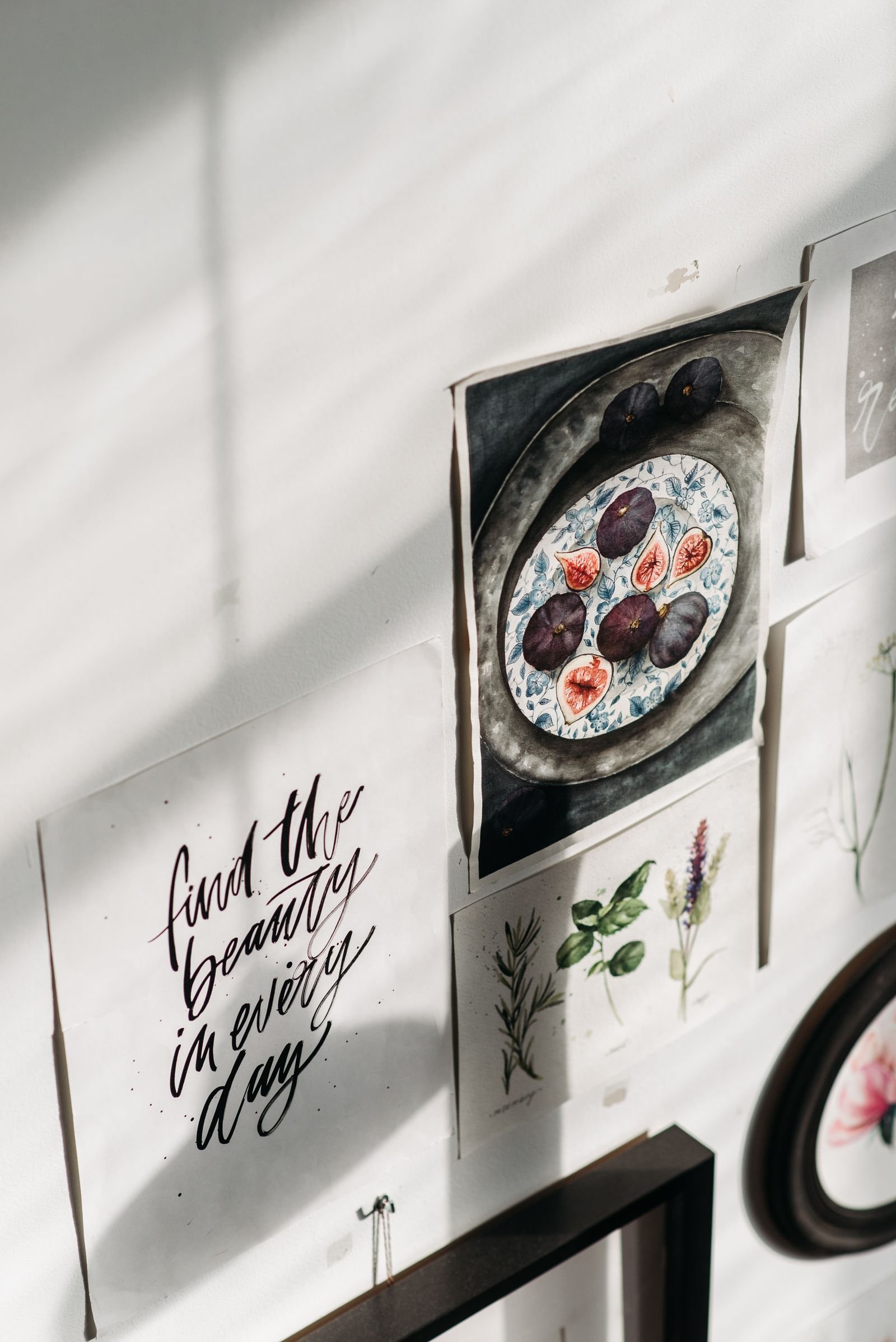
moody botanical print decor ideas
Moody botanical prints — dramatic dark-background florals, inky leaves, and shadowy garden scenes — bring the romance of a Victorian conservatory into the modern home. Unlike bright, airy botanical art, the moody variety uses deep charcoal, forest, and near-black grounds that make every petal and leaf glow with chiaroscuro intensity, like flowers lit by candlelight. It is sophisticated, a little mysterious, and surprisingly versatile, working in maximalist living rooms and minimalist bedrooms alike, in rentals and forever homes. This guide offers twenty ideas for decorating with moody botanical prints: choosing art with genuine depth, framing, gallery walls, oversized statements, room-by-room styling, DIY and budget options, and the colour, textile, and lighting choices that let dark florals sing rather than sink.
What Makes a Botanical Print “Moody”?
The moodiness comes from contrast: luminous botanical subjects painted or photographed against dark, often near-black backgrounds. Think Dutch Old Master flower paintings, where roses and peonies emerge from shadow as if lit by candlelight. Modern versions include dark floral photography, deep-toned botanical illustrations, and oversized leaf prints on charcoal grounds. The effect is dramatic yet natural — the darkness reads as depth rather than gloom. These prints carry visual weight, so they anchor a room the way a dark accent wall does, but with organic softness. They suit anyone drawn to romantic, collected interiors and pair beautifully with vintage furniture, brass, velvet, and warm wood tones.
The trend’s roots in Dutch Old Master painting give it unusual longevity; this is an aesthetic with four centuries of proof behind it.

Choosing the Right Prints for Your Space
Start by considering scale and subject. Large-scale statement pieces — a single oversized dark peony or monstera leaf — create instant drama and suit living rooms and bedrooms. Smaller prints work in groupings for hallways and gallery walls. In subject matter, mix florals with foliage: all flowers can feel sweet, while leaves, ferns, and branches add the wildness that keeps moody botanicals from tipping pretty. Look for prints with genuine depth — layered shadows, visible texture, rich blacks rather than flat grey. Source from art print shops, museum collections (many Dutch Masters are public domain and print beautifully), and independent artists. Order sample sizes first; dark prints can read very differently at full scale.
Order the smallest available size first to check colour and quality; dark prints are the most likely to disappoint when scaled up unexpectedly.
Framing: What Works with Dark Florals
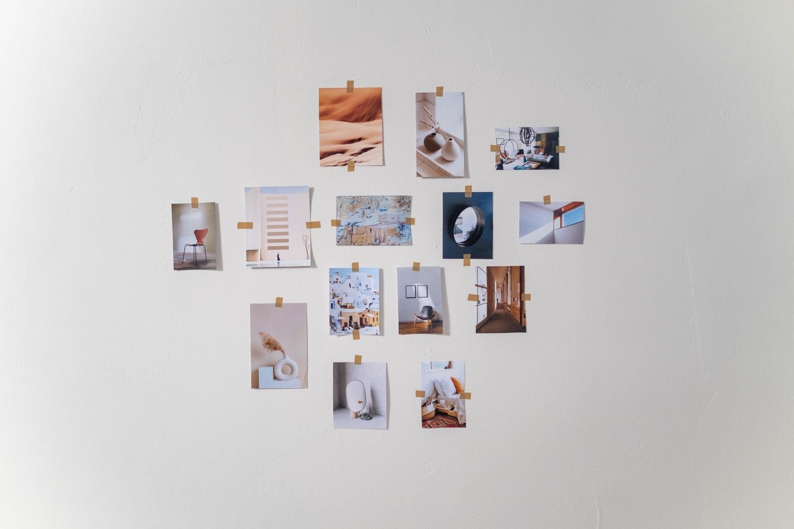
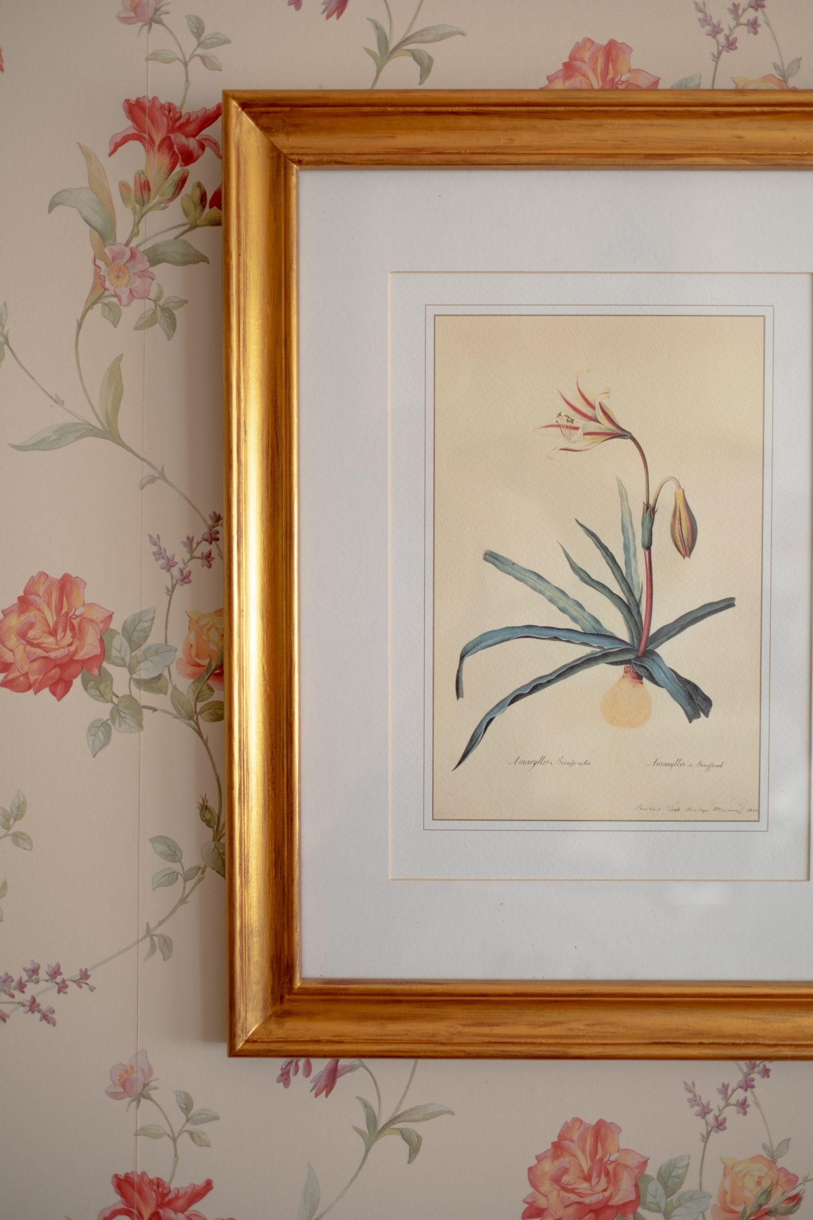
Framing makes or breaks moody prints. Thin black frames disappear into the dark background, letting the image float — sleek and modern. Antique gold or brass frames add Victorian richness and catch the light beautifully against dark art. Natural oak frames warm the look and suit Scandinavian-moody hybrids. For a gallery wall, mixing black and brass frames in similar profiles creates collected, curated rhythm. Always use a mount (mat) in warm white or cream for smaller prints — the breathing room intensifies the drama of the dark image. Consider anti-reflective glass for large pieces opposite windows; glare kills the depth that makes these prints special. Quality framing elevates even an inexpensive print.
For a cohesive gallery wall, keep all frames within two finishes; the consistency lets varied artwork feel collected rather than chaotic.

The Gallery Wall: Curating Dark Botanicals
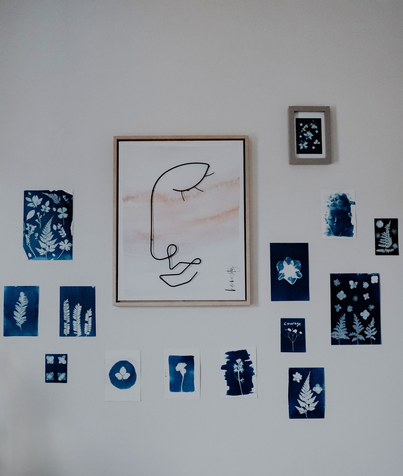
A gallery wall of moody botanicals is a showstopper when curated with intention. Mix sizes — one large anchor piece with medium and small companions — and vary subjects: florals, leaves, seed heads, and the occasional landscape or abstract for rhythm. Keep frames within two finishes for cohesion. Lay the arrangement on the floor first, photograph it, and live with the photo for a day before hanging. Spacing of 5–8 centimetres between frames reads as intentional; wider gaps feel scattered. Gallery walls suit hallways, staircases, and the wall behind a sofa. Include one non-botanical element — a mirror, a brass sconce, a small shelf with a plant — to keep the wall from feeling like a museum exhibit.
Leave at least fifteen centimetres of clear wall around an oversized piece; crowding kills the breathing room that gives large art its power.

Statement Walls and Oversized Art
One enormous moody botanical print can carry an entire room. Oversized pieces — 100 centimetres and up — work above sofas, beds, fireplaces, and dining tables, where they function like a window into a dark garden. When going big, choose images with strong composition and fine detail that reward close viewing: the veining of a leaf, the unfurling of a petal. Hang the centre at eye level, roughly 145 centimetres from the floor. Give the piece breathing room — do not crowd it with nearby furniture or competing art. A single spotlight or picture light transforms an oversized dark print after dark, pulling the florals out of shadow. This is the highest-impact, lowest-effort way to embrace the trend.
A picture light with a warm bulb transforms dark art after sunset; without dedicated lighting, moody prints simply vanish into evening gloom.
Living Room Styling
In the living room, moody botanicals add soul to seating areas. Hang a large piece above the sofa, or lean a medium print on the mantel layered in front of a mirror for depth. Echo the palette in soft furnishings: cushions in deep green velvet, throws in inky floral prints, a rug with dark botanical motifs. Brass floor lamps and warm wood furniture harmonise with the romantic tone. Balance the darkness with light elsewhere — cream upholstery, pale curtains, or a light rug keep the room from feeling heavy. Plants are the perfect companion: real greenery against dark botanical art creates a layered, conservatory-like depth that makes the whole room feel alive.
Repeat one colour from your prints in a cushion or throw; the echo ties the art to the room and makes the styling feel intentional.

Bedroom: Dark Romance Without Gloom
Bedrooms are natural territory for moody florals — the intimacy suits the drama. Hang a pair of matching botanical prints above the bed for symmetry, or a single wide piece for a modern look. Keep bedding light — white, cream, or pale sage linen — so the room stays restful; the art provides the drama, the bed provides the calm. A velvet headboard in deep green or aubergine amplifies the romance. Bedside lamps with warm bulbs and fabric shades cast the flattering low light these prints love. Avoid going dark on every surface: if the art is moody, the walls can stay light. The result is a bedroom that feels like a secret garden — enveloping, romantic, and deeply restful.

Hallways, Staircases and Small Spaces
Dark hallways and staircases — often decorating afterthoughts — are ideal for moody botanicals, which thrive in low light that would wash out paler art. Line a hallway with a series of small matching prints for a gallery effect that draws the eye forward. On staircases, hang prints following the stair’s diagonal, keeping the centre line consistent. In powder rooms and small studies, a single dramatic print makes the compact space feel intentional and jewel-like. These transitional spaces benefit most from picture lights or well-placed spots, which turn the art into a glowing focal point. Do not neglect these areas — a moody print in a dark hallway delivers disproportionate impact for its cost.
In bathrooms, mount prints with sealed backs and keep them away from direct splashes; steam is fine, but constant water contact is not.
Bathrooms and Unexpected Places
Moody botanicals love humidity-adjacent drama — a dark floral print above a freestanding tub is pure Victorian indulgence. In bathrooms, choose prints behind glass with sealed frames to protect against moisture, and avoid hanging directly above splash zones. Beyond the bathroom, consider unexpected placements: the wall above the kitchen table, inside a bookcase, the back of a door, or even the ceiling of a small cloakroom for full immersion. A moody print in an unexpected spot feels like a discovered treasure rather than decoration. Kitchens suit herb and vegetable botanicals — dark-background prints of figs, artichokes, or herbs bridge the botanical theme with culinary function beautifully.
Test paint swatches directly against your prints in both daylight and lamplight; colours shift dramatically and the art is the reference point.
Colour Palettes That Complement Dark Florals
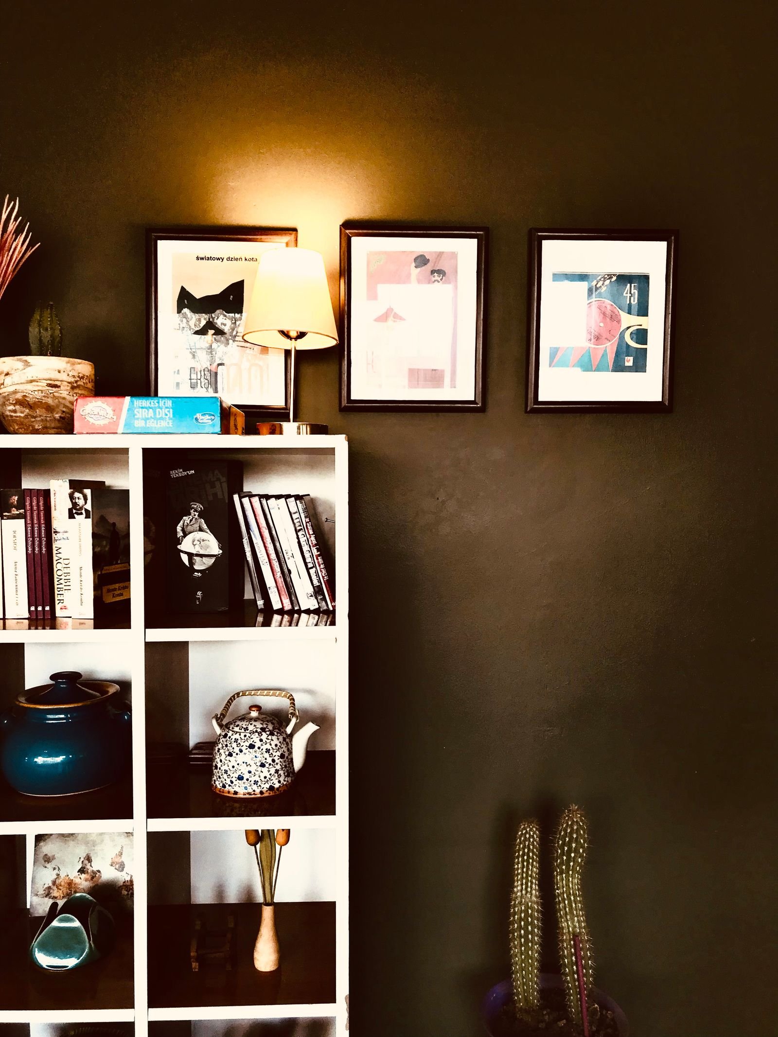
Moody prints dictate a supporting palette. Wall colours that sing behind them: deep forest green, charcoal, warm dark taupe, and even the same near-black as the print backgrounds for a cocooning effect. If dark walls feel too committed, warm whites and soft sages let the prints provide all the drama. Furnishing colours to echo: brass and antique gold, cognac leather, deep green velvet, cream linen, and natural wood. Avoid cool greys and stark whites in large doses — they fight the warmth of the romantic palette. The guiding principle is tonal harmony: everything in the room should feel like it could exist in the same candlelit garden as the art. Test paint swatches against your prints before committing.
Angle spotlights at thirty degrees to minimise glare on glass; the light should wash the art, not bounce straight back at viewers.
If a print arrives damaged or colours look wrong, reputable sellers replace or refund quickly; photograph the issue immediately and contact them within a day or two.
Lighting Dark Art Properly
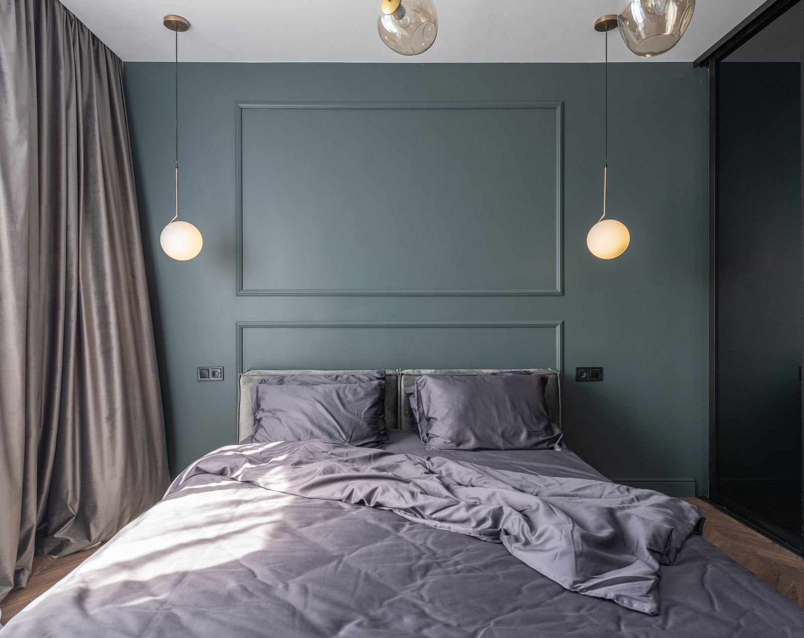
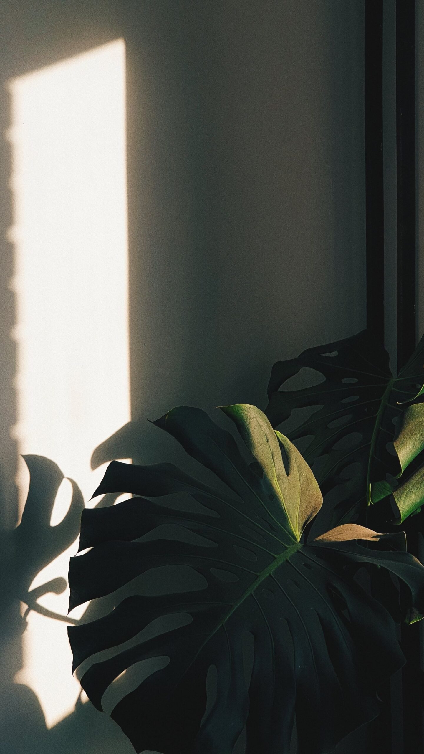
Dark prints absorb light, so deliberate lighting is essential. Picture lights mounted above frames are the classic solution, washing the art in warm, even light. Adjustable spotlights on tracks allow precise aiming for gallery walls. In general, light moody prints more brightly than you think necessary — what looks correct in daylight will vanish into murk under evening ambient light alone. Use warm bulbs (2700K) to enhance the romantic tone; cool light flattens dark florals. Avoid placing dark prints where they receive direct harsh sunlight, which fades pigments and creates glare. The goal is for the florals to emerge from the darkness as if lit from within — lighting is what creates that magic.
When mixing art styles, unify with matching frames; consistent framing lets wildly different subjects coexist peacefully on one wall.
Mixing Moody Botanicals with Other Art Styles
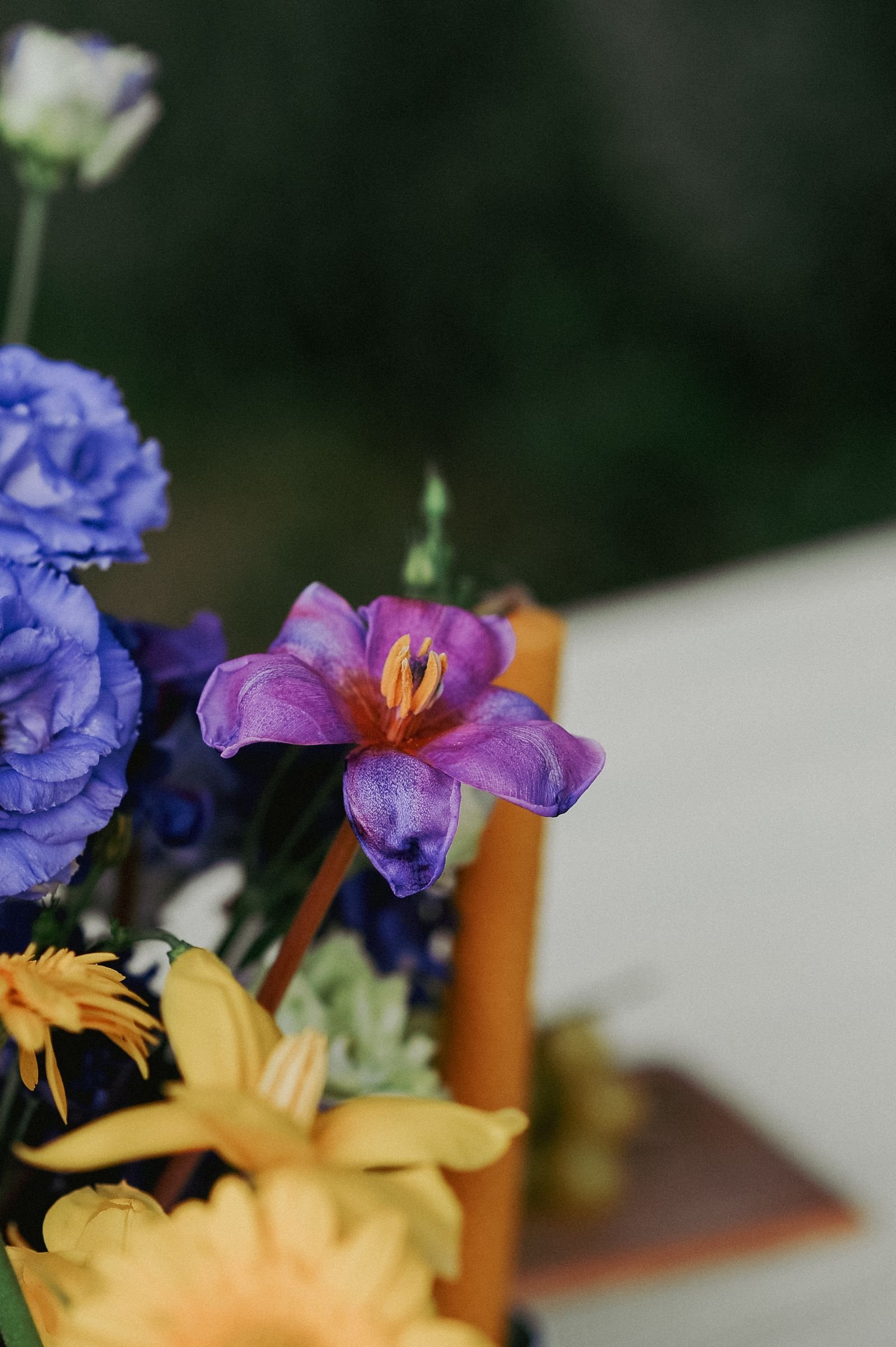
Moody botanicals play well with others when the palette connects. Pair them with abstract art in matching dark tones for a contemporary edge, or with vintage landscape paintings for a full old-master gallery feel. Black-and-white photography — architectural or portrait — adds graphic contrast. The key is a shared tonal range: keep all pieces within the same light-to-dark spectrum so the wall feels cohesive. Vary the subjects and mediums for interest: a dark floral photograph beside an ink botanical illustration beside a small oil landscape. Unify with consistent framing. This mixed approach suits eclectic, collected interiors and prevents the botanical theme from feeling like a single-note concept.
Shooting your own botanical photos costs nothing and guarantees originality; a phone, black card, and window light are genuinely enough.

DIY and Budget Options
The moody botanical look is highly achievable on a budget. Public-domain Old Master flower paintings — from artists like Rachel Ruysch and Jan van Huysum — can be downloaded in high resolution from museum websites and printed affordably. Photograph your own: shoot flowers against black velvet or card in soft window light with your phone, then print — the results can be stunning. Press real leaves and flowers and frame them against dark card for authentic botanical specimens. Thrift stores yield brass frames for pennies; a coat of black spray paint unifies mismatched frames. Even fabric — dark floral curtain material stretched over a canvas frame — makes convincing large-scale art. The aesthetic rewards resourcefulness.
Textiles and Soft Furnishings
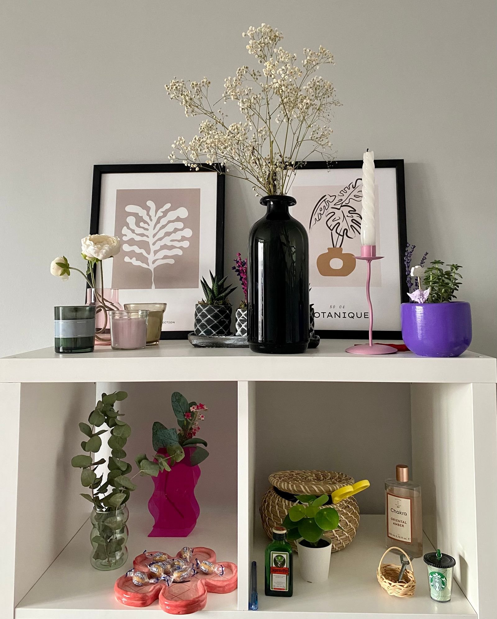
Extend the botanical mood beyond the walls. Curtains or bedding in dark floral prints — William Morris designs are the heritage choice, modern dark florals the contemporary one — immerse the room. A rug with a faded, dark botanical pattern grounds seating areas in the palette. Cushions mixing large-scale florals with small-scale leaves and solid velvets in deep green or plum create collected richness. The trick is varying scale: if your art features large blooms, choose textiles with smaller motifs, and vice versa, so the patterns do not compete. Keep at least half your soft furnishings solid to give the eye rest. These layers turn a room with botanical art into a room with a botanical soul.
Vary textile pattern scales against your art; if the print features large blooms, choose cushions with small motifs so nothing competes.
Real Plants as Companions
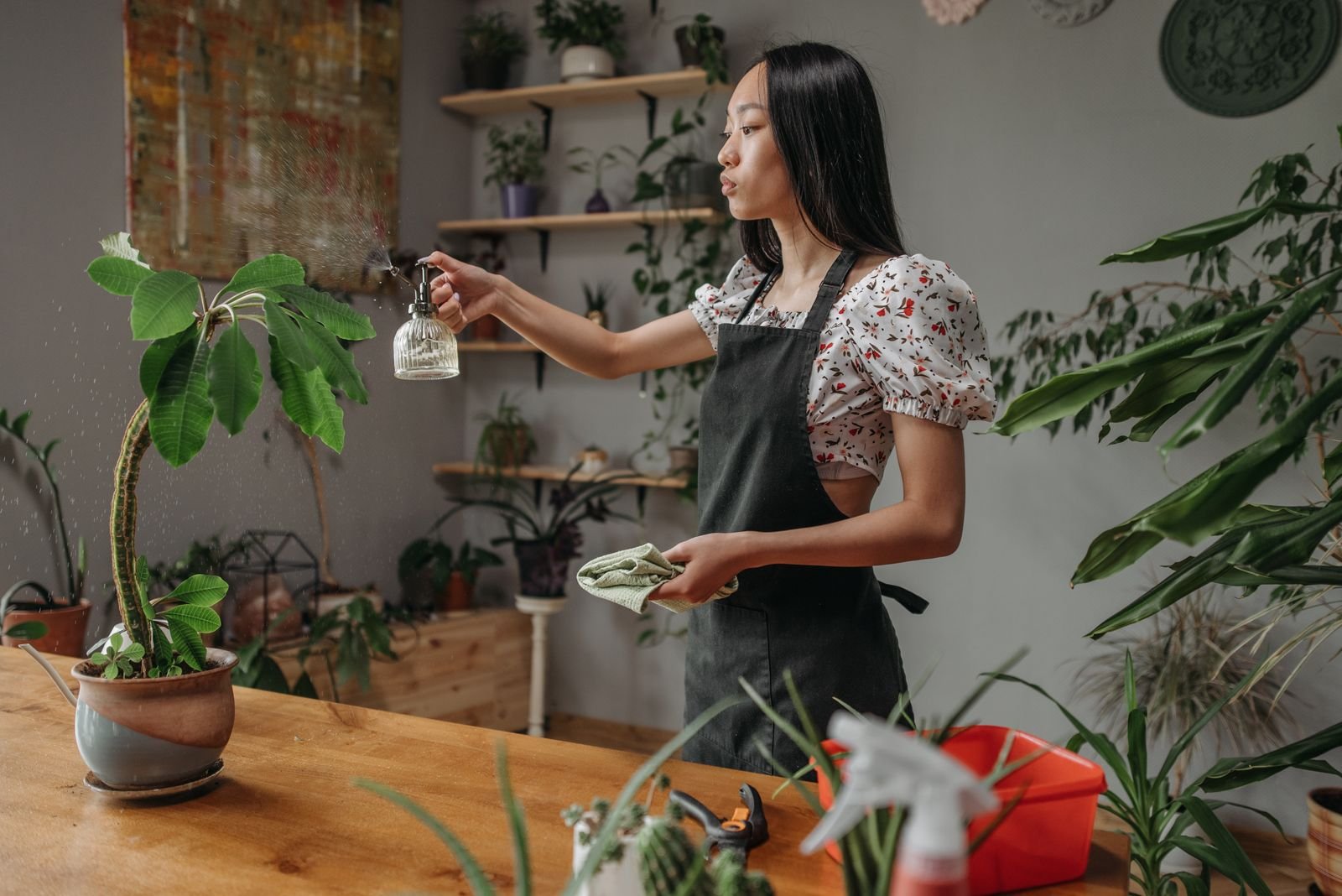
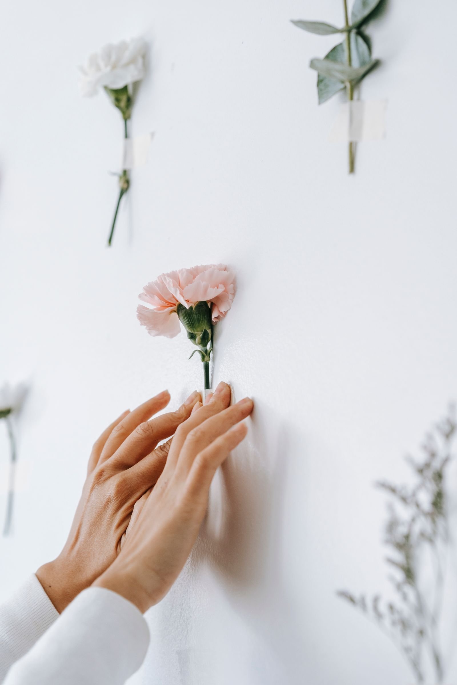
Live plants are the perfect partners for botanical prints, blurring the line between art and nature. Place a real monstera beneath a monstera print, or ferns beside fern illustrations, for a delightful echo. Trailing plants on high shelves soften the formality of framed art. Choose plants with dramatic foliage — calathea, alocasia, bird of paradise — that hold their own against bold prints. The care is simple: match plants to your light conditions and water consistently. This living layer adds movement, air quality, and authenticity that no print can provide. A room with both botanical art and thriving plants feels like a conservatory — cultivated, alive, and quietly luxurious.
Group plants in odd numbers near your prints; the asymmetry feels natural and the layered greenery deepens the conservatory effect.
Seasonal Styling with Moody Botanicals
Moody botanicals are seasonless, but small swaps keep them feeling current. In autumn, add dried wheat, pumpkins, and amber glass around the art — the harvest palette deepens the existing mood. Winter calls for evergreen sprigs, brass candlesticks, and velvet textures that echo the prints’ richness. Spring lightens the companions: pale ceramics, fresh tulips, linen throws — the dark art anchors the freshness. Summer brings bold real florals that mirror the prints’ drama. The art itself never needs changing; it is the supporting cast that rotates. This longevity is the trend’s practical superpower — invest once in art you love, and style around it forever.
Swap cushion covers and throws seasonally while the art stays put; the prints are the constant and the textiles provide the seasonal shift.
Common Mistakes to Avoid
Several missteps dull the drama. Hanging dark prints in dark rooms without dedicated lighting — they simply disappear. Choosing prints with muddy, flat backgrounds instead of rich, layered blacks — the difference between “moody” and “murky” is depth. Overcrowding: too many dark pieces without light relief overwhelms; balance with pale textiles and breathing room. Clashing undertones — cool grey-black prints against warm brown furniture — creates subtle discord; keep blacks warm or neutral. And neglecting scale: tiny prints lost on vast walls, or enormous pieces crammed into small rooms. Measure your wall, mock up with paper templates, and light deliberately. Moody botanicals reward planning.
Where to Source Quality Prints
Quality sources abound at every price. Museum shops and open-access collections (the Rijksmuseum, the Met) offer high-resolution public-domain florals for self-printing. Independent artists on print marketplaces sell original dark botanical photography and illustration — buying direct supports artists and guarantees uniqueness. High-street home stores carry on-trend dark florals affordably, though designs may be ubiquitous. For investment pieces, consider limited-edition photographic prints from galleries. Whatever the source, check the printing quality: giclée on heavyweight archival paper or canvas gives the depth these images need; cheap thin posters curl and reflect. A £15 print in a £40 frame almost always looks better than a £40 print in a £5 frame.
Check seller reviews for colour accuracy before ordering prints online; dark botanicals are the category most prone to disappointing reproduction.
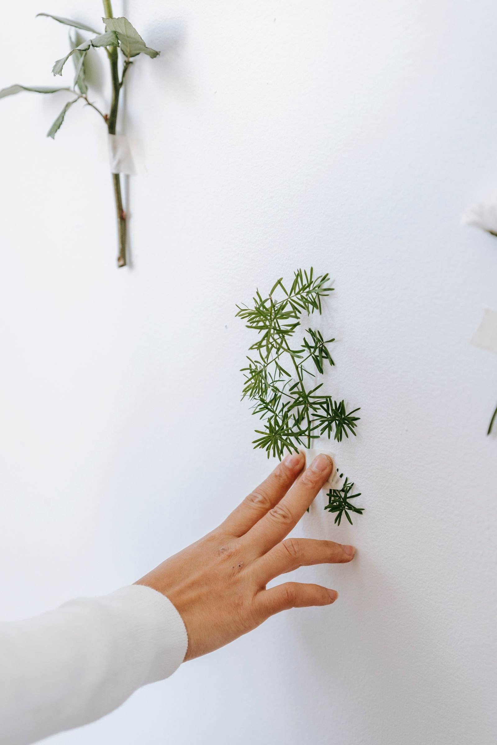
Styling Shelves and Ledges with Botanical Art
Picture ledges offer a flexible, renter-friendly way to display moody botanicals. Layer prints of varying sizes along a ledge, overlapping slightly, interspersed with small plants, brass objects, and books. The layered look feels collected and can be rearranged seasonally in minutes. On bookshelves, lean small botanical prints among books — the art peeks between spines like a discovered treasure. Style the surrounding objects in the palette: amber glass, dried botanicals, dark ceramics. Keep the arrangement asymmetrical for a natural feel. Ledges are also ideal for testing placements before committing to nails in the wall — live with the arrangement for a week, then hang the keepers permanently.
Leaning art on deep shelves lets you layer prints with plants and objects; the casual arrangement suits renters and commitment-phobes alike.
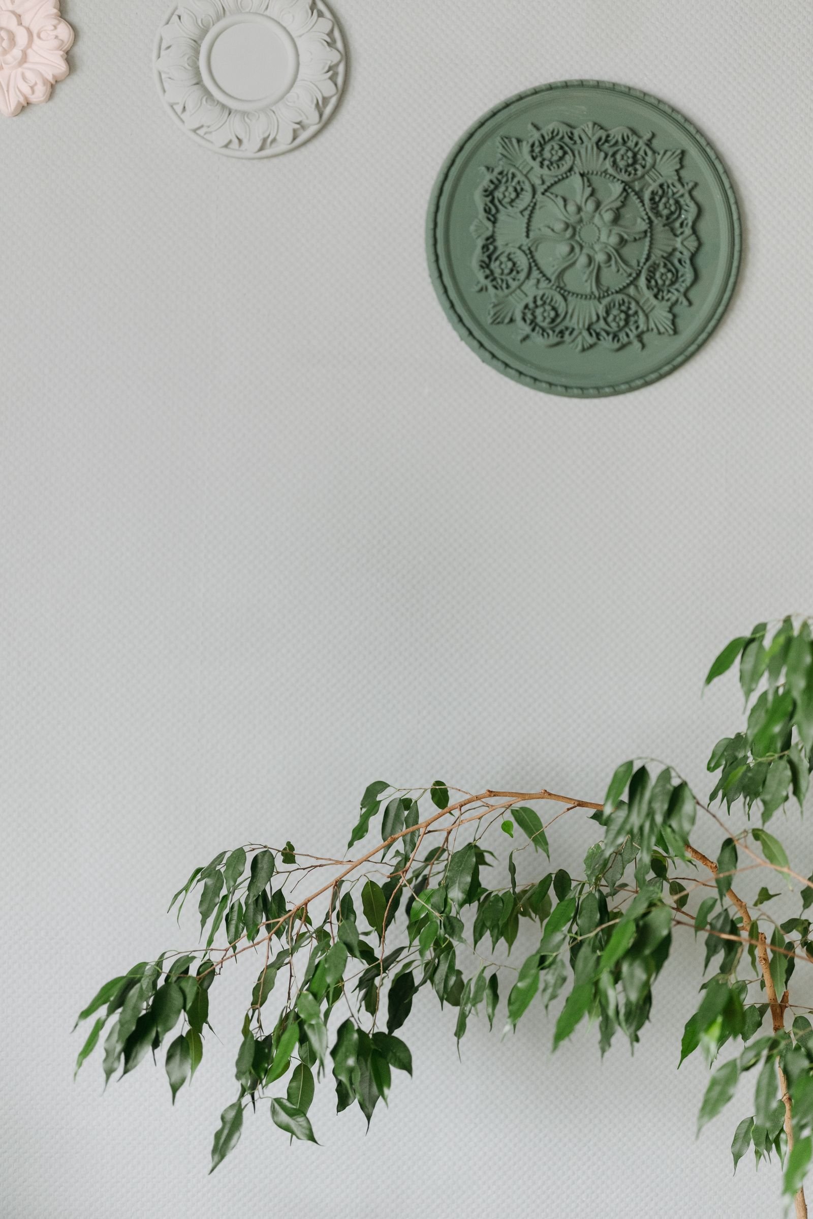
Renter-Friendly Approaches
Renters can fully embrace moody botanicals without drilling. Lean large prints on mantels, consoles, and floors — the casual lean suits the romantic aesthetic. Use picture ledges, adhesive strips rated for the frame weight, or freestanding easels for display. Removable dark floral wallpaper on a single wall creates dramatic backdrop for simpler framed pieces. Large-scale art can simply rest on the floor against a wall for a gallery-casual look. Focus on textiles and plants — dark floral bedding, curtains, and dramatic houseplants — which need no wall fixing at all. When you move, the entire collection travels with you. The moody botanical look is one of the most renter-compatible trends in interiors.
Moody botanical prints offer the rare combination of drama and timelessness — dark enough to feel current, rooted enough in centuries of art history to never date. Choose prints with genuine depth, frame them well, light them deliberately, balance their visual weight with pale textiles and living plants, and let the collection grow slowly like the garden it depicts. Whether you hang one oversized peony or curate a full gallery wall, these shadowy florals will give your home the depth and romance of a candlelit garden all year round.

I am Talha Sikandar, a professional writer with a passion for general blogging. With years of experience in content writing and research, I founded Meaniingly.com to deliver well-researched, informative, and user-friendly articles on diverse topics.